Background
Givelify's B2B platform allows organizations, particularly 501(c)(3) religious nonprofit organizations, to collect digital payments from donors. However, Givelify Analytics Studio users, mainly church administrators of older age, were struggling to manage their list of funds.
Users unhappy with redesigned fund management
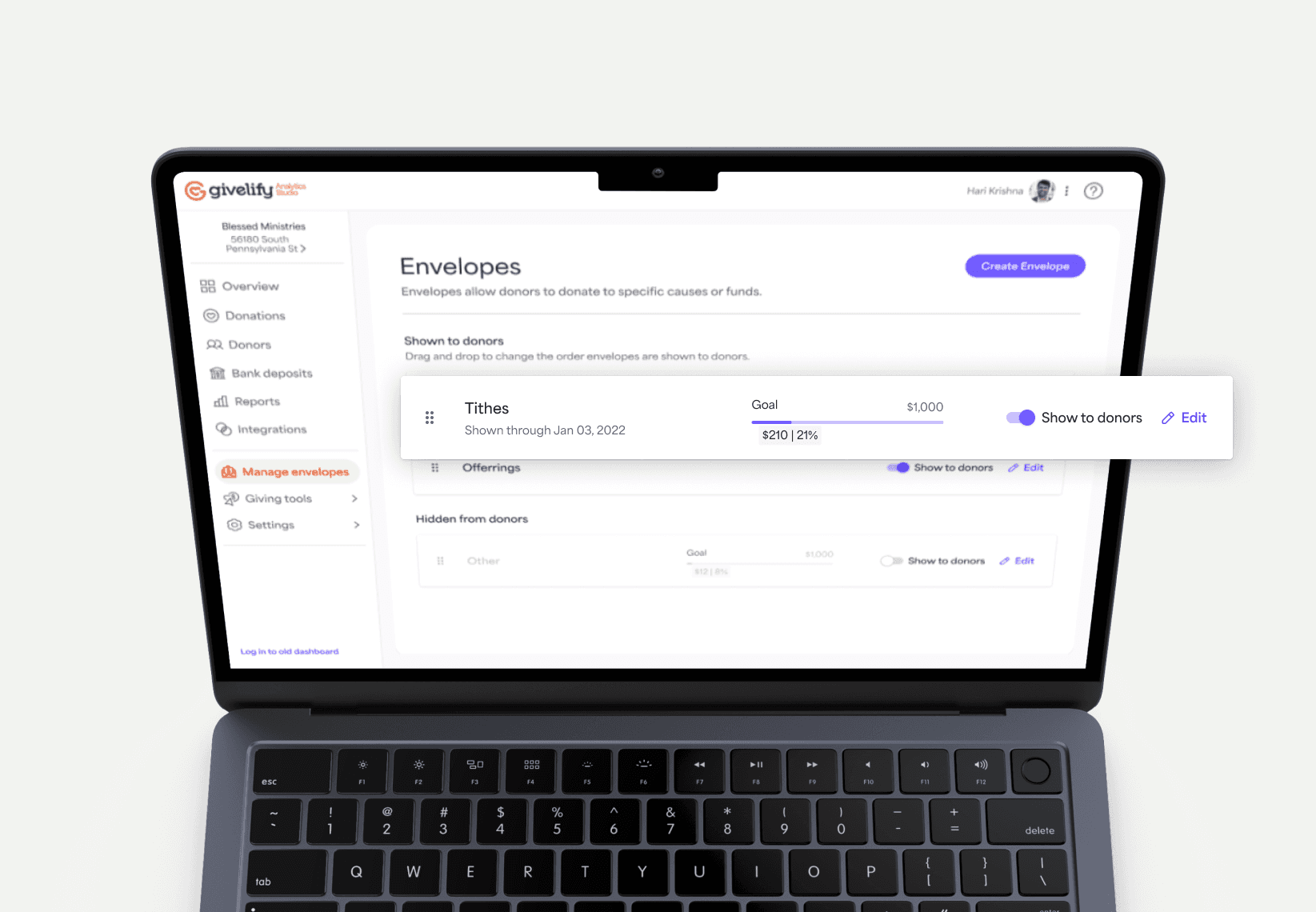
We got multiple customer feedback from church administrators, our main users of the analytics platform, that the fund management for the redesigned Givelify Analytics Studio caused a lot of confusion. We had undergone a huge redesign of the analytics studio that gave the product a much refreshed look and feel, but it lost a core part of why users loved our app so much – the simple UX. They were going back to the old dashboard to complete this task. From a business goal, we needed to sunset the old dashboard and needed to get users to adopt the new analytics studio dashboard. Since the church administrator enable the adoption of the B2C product, we needed to make sure that we fix the fund management so that funds can be easily collected through Givelify.
Most users are not tech-savviness and has low budgets
The analytics studio user base consisted of church administrators who were a majority of older users (ages 40+) who tend to be working in organizations without experience with advanced SAAS technologies due to lower budgets. Since Givelify largely served 501(c)(3) religious nonprofit organizations with these constraints, we had to ensure that we design for the upmost simple user experience.
How might we re-imagine the fund (envelope and campaign) experience so that it is easy enough for the least technical admin user to create, edit, re-arrange, show, and hide funds?
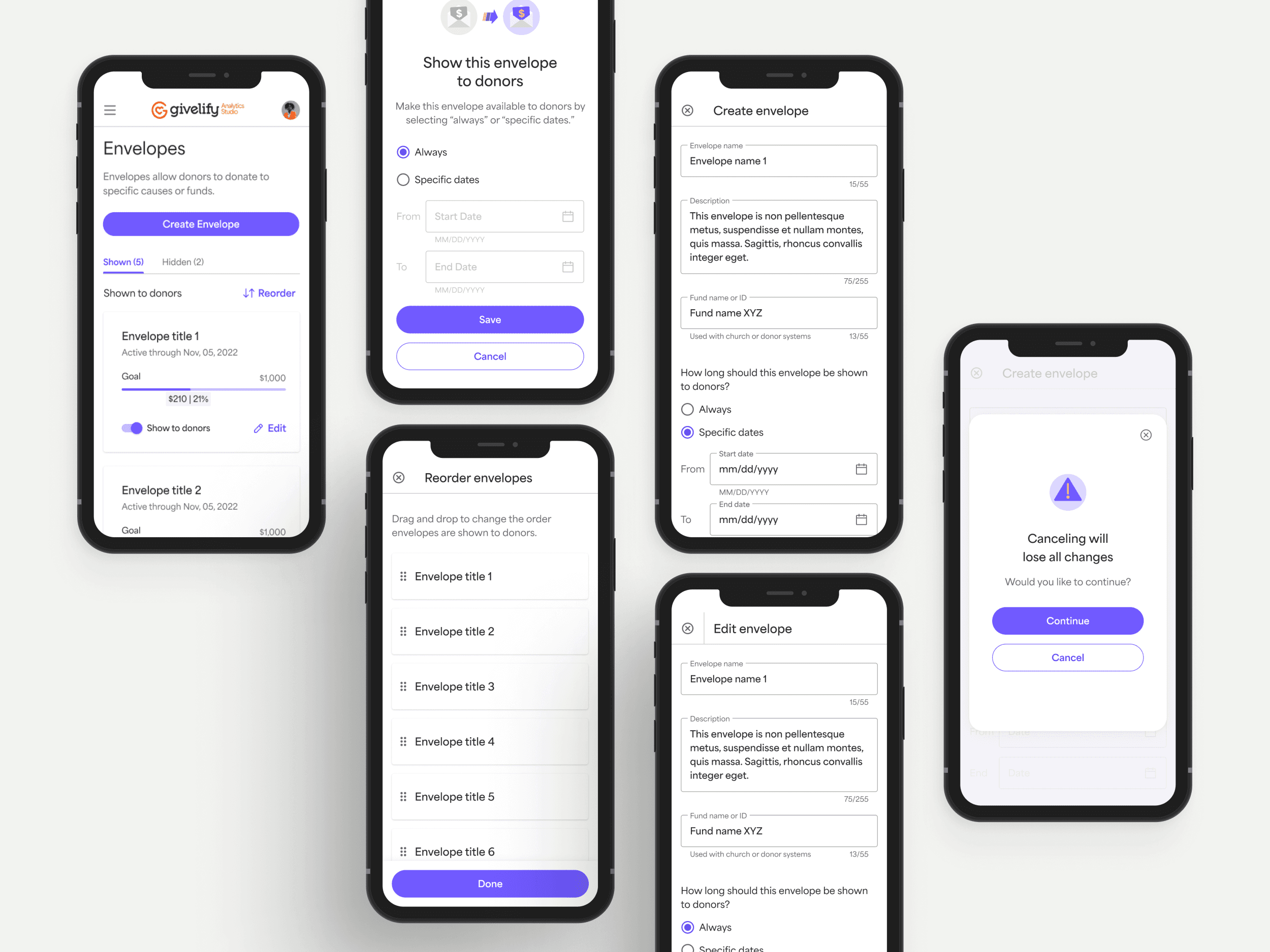
Simplicity is the best approach
The design focused on simplicity, breaking apart the old user flow, and incorporating use cases to guide ideation. Collaboration with engineering and product teams ensured alignment on acceptance criteria and scope definition. The designs were optimized for both desktop and mobile devices, considering the needs of users who manage funds on the go.
Interaction for delight and clarity
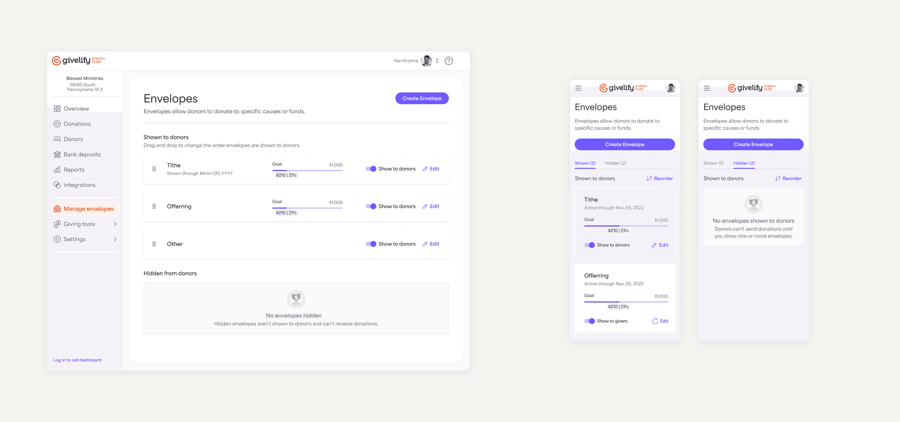
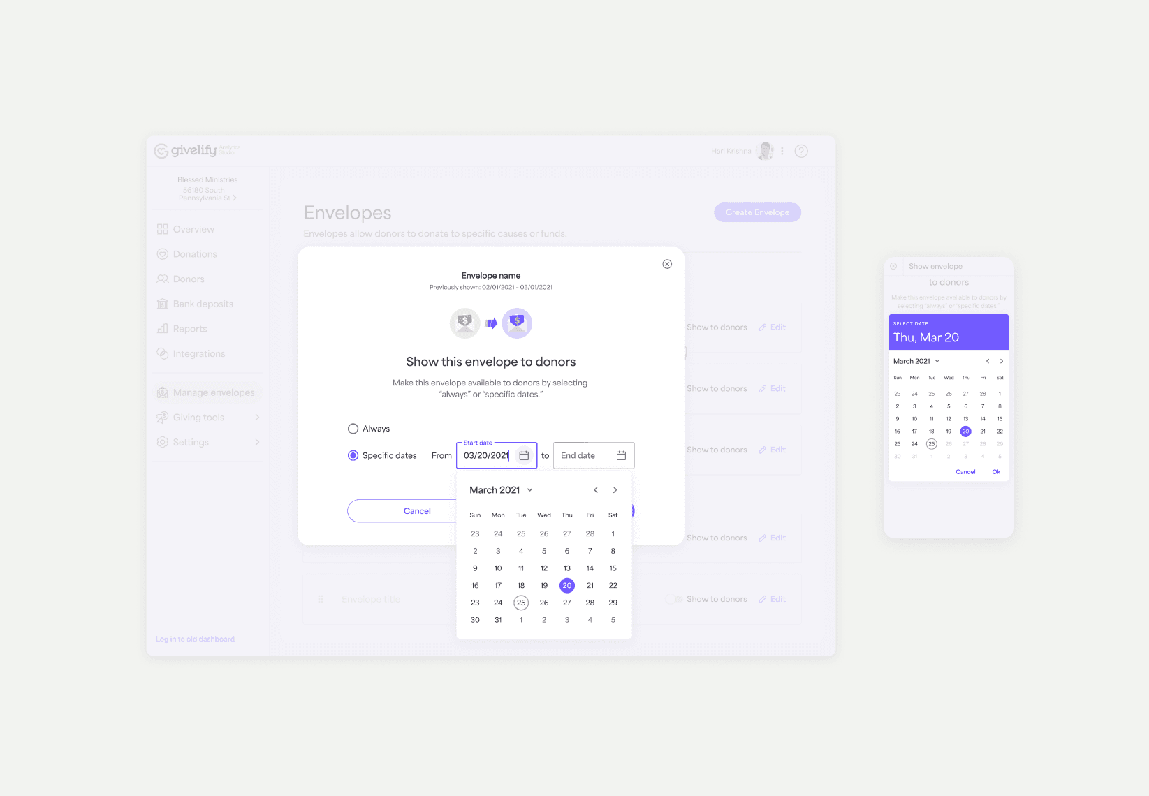
The solution included a redesigned fund management interface with clear categorization of active and inactive funds. Envelopes were separated into shown and hidden parts of the list, with the ability to switch between them easily. The design system was updated to include components for interactive elements, micro-animations, and mobile responsiveness for both the date input field and calendar component.
In order for the developers to have all the information, interactive prototypes were created to show the happy path as well as the special animations for envelope re-ordering to indicate a loading state for latency considerations in addition to errors that may occur when action is committed by the user.
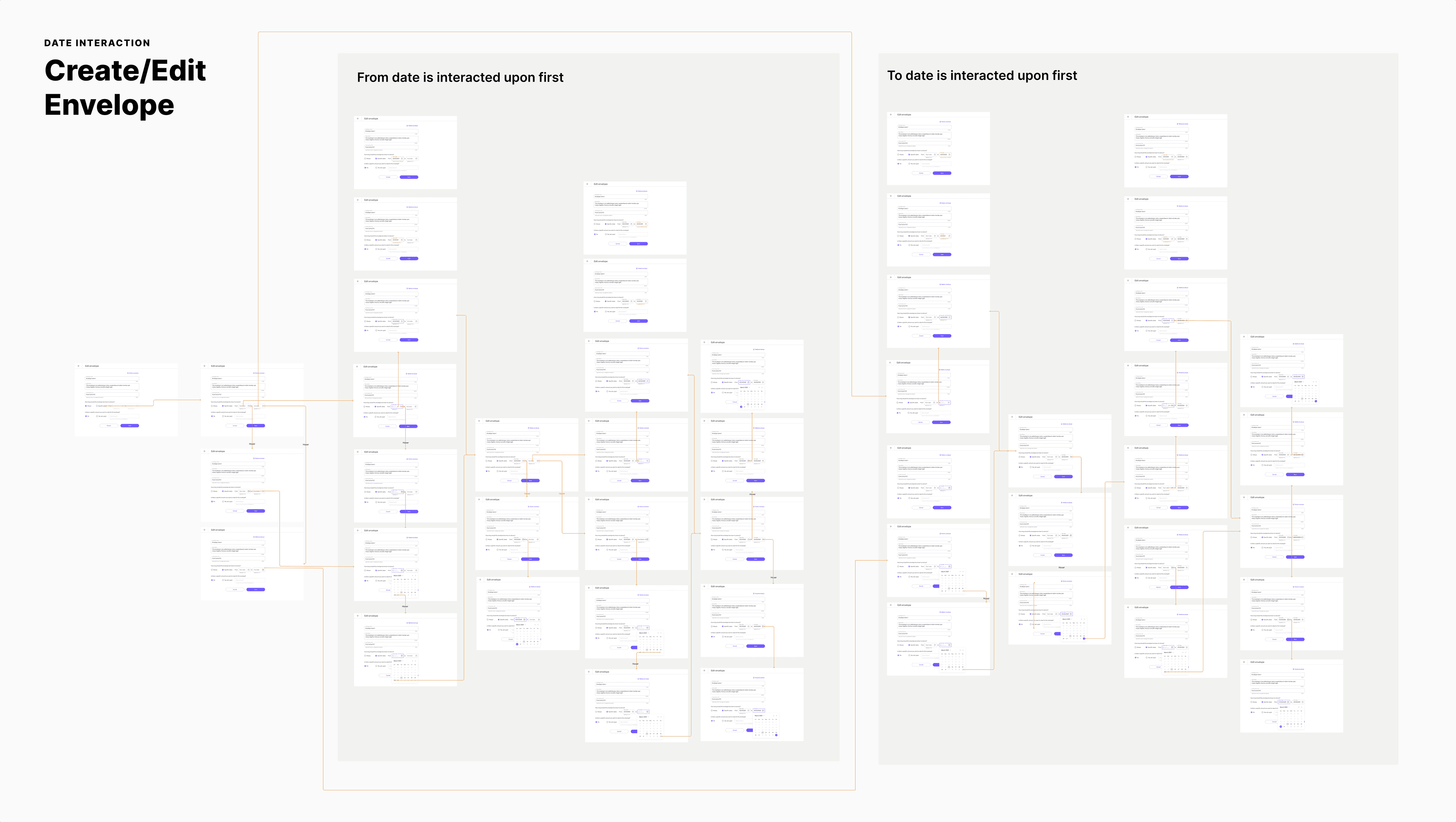
Flows for the modal and create/edit fund experience were created to give guidance to the developers of when each date input field and calendar states are used in addition to the error messages that may arise from manually entered dates.
Results and Future Iterations
The redesigned fund management interface has improved user satisfaction and adoption rates of the new Analytics Studio dashboard. This project highlights the importance of designing for user needs and iteratively improving the user experience to meet evolving requirements.
98%
User satisfaction rating after survey release
44%
Increase in adoption of envelope feature
12%
Less time spent onboarding envelope creation