Background
Givelify faced a significant challenge with inconsistent components, interactions, and styles scattered across various design files and libraries. This led to redundant work for designers and developers, causing frustration and inefficiency. The absence of a single source of truth for basic design foundations hindered collaboration and consistency across the product.
Recognizing the need for a unified approach, Givelify aimed to create a design system to streamline design and development processes, increase consistency, and improve accessibility.
Creating order from disorder
The first step involved auditing existing design files, style guides, and component libraries to understand the extent of inconsistency. Over 1,000 redundant components, interactions, and patterns were identified and consolidated in the developer Storybook and live production environment.
Further, I ran a card sorting session with our product design team to uncover 2 things:
1. What are the names of all the existing components that all the product designers can agree upon?
2. How do the designers naturally group and categorize these components?
Another goal of this exercise was to prime their knowledge of groupings in advance so that when they do use the design system in the future, they would know the components, their makeup, and patterns that exist in the system as well as where they may belong. The card sorting activity unveiled lots of differences in the language of the components as well as the way designers would naturally group them. I understood this was end-all solution but a good place to start grouping our components, knowing we would naturally iterate and evolve the groupings.
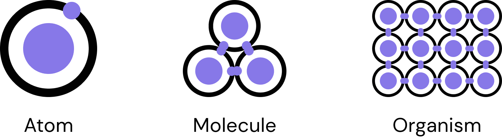
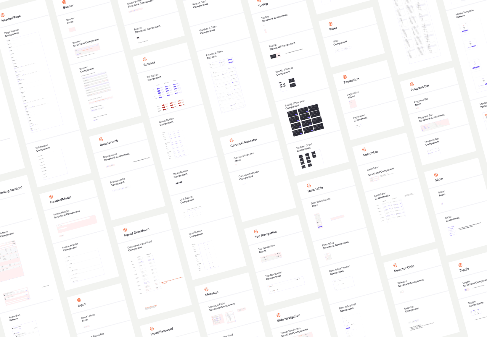
In addition, because our product was constantly evolving, our main requirement of the design system was to create a flexible architecture that could adapt to future changes easily. In order to make this possible, I used the Atomic design framework due to the extreme modularity by breaking down all elements to their fundamental building blocks. I audited the current component libraries, listed all the existing components, and broke apart each component by atoms, molecules, and organisms so that we can re-create all of the components atomically.
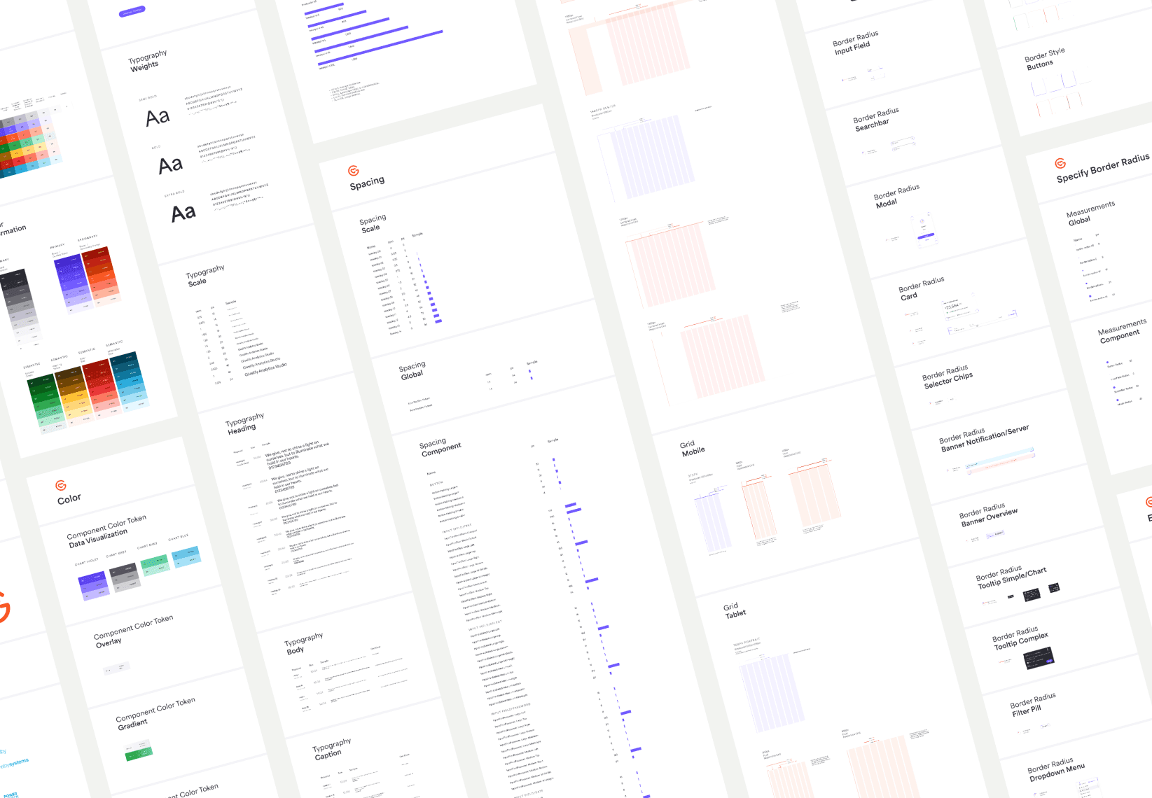
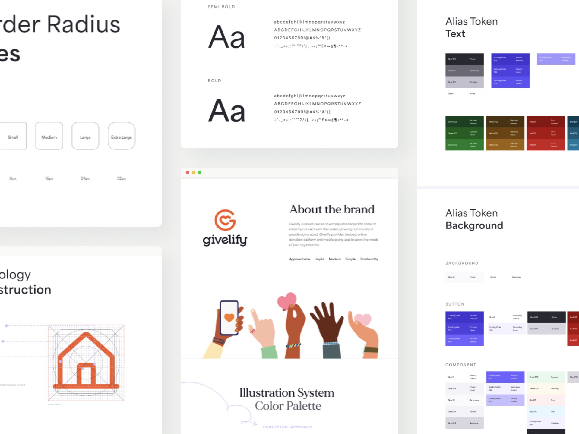
Foundation
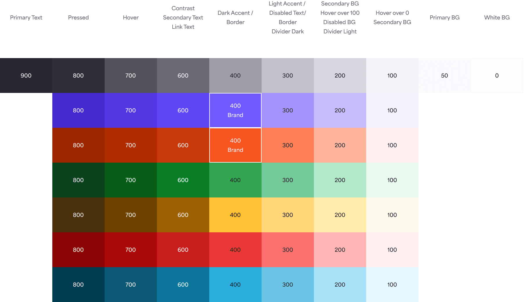
The design system aimed to incorporate the latest branding while creating a distinct look and feel for Givelify's product. I gathered all the different uses of color, typography, spacing, shadows, border styles and radius, and grids and made comparisons to where and how they were used and if I could find some alignment between them. I collaborated with the B2B and B2C lead designers to finalize the final type and color scales to ensure brand fit and the usage logic, while ensuring good hierarchy, readability, and accessibility (WCAG 2.2).
Components
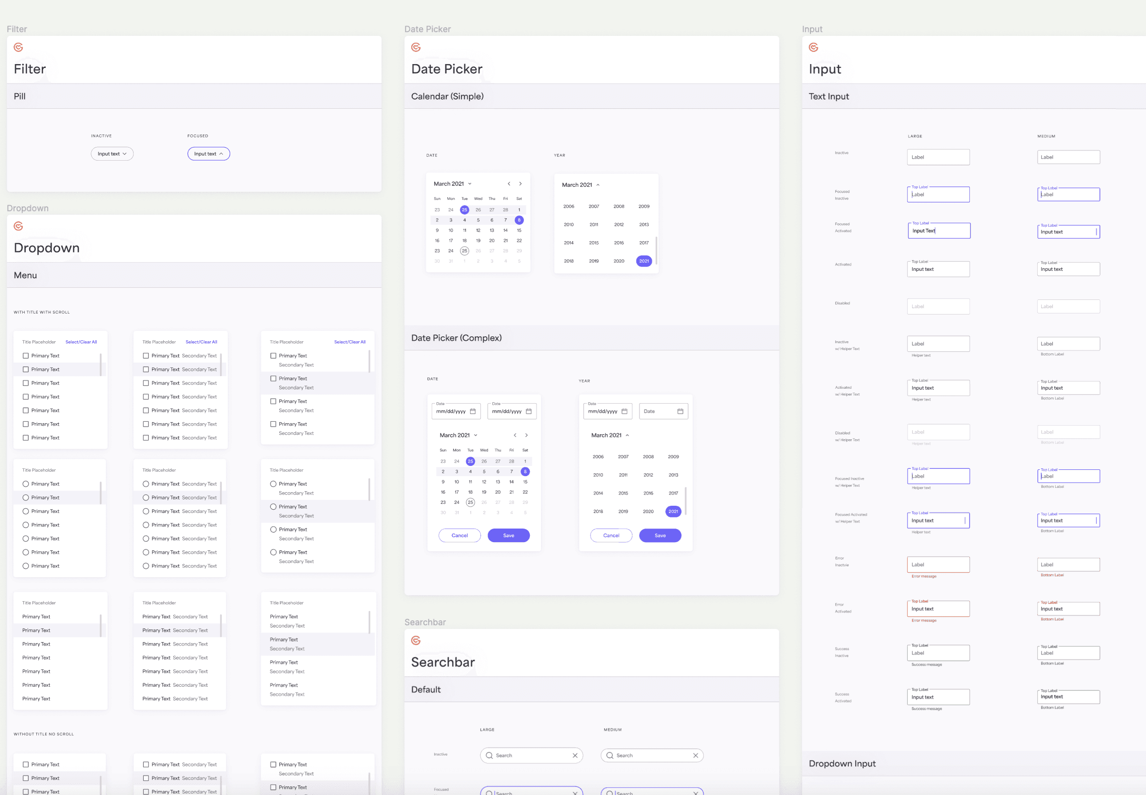
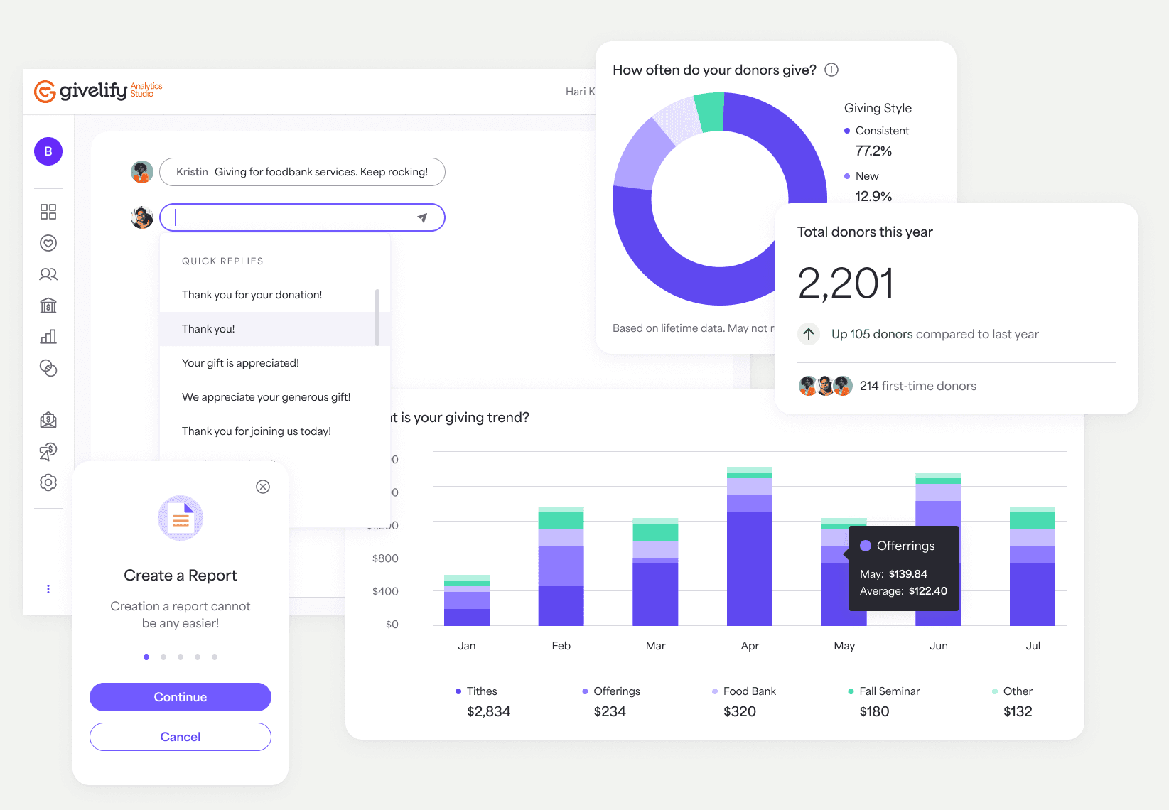
A modular, atomically built component system was developed to ensure flexibility and scalability. Components were designed to include all associated interactions, animations, and states. In addition, be built with auto-layout to ensure responsiveness to different device sizes, with a focus on enhancing usability and accessibility (WCAG 2.2).
Developer collaboration
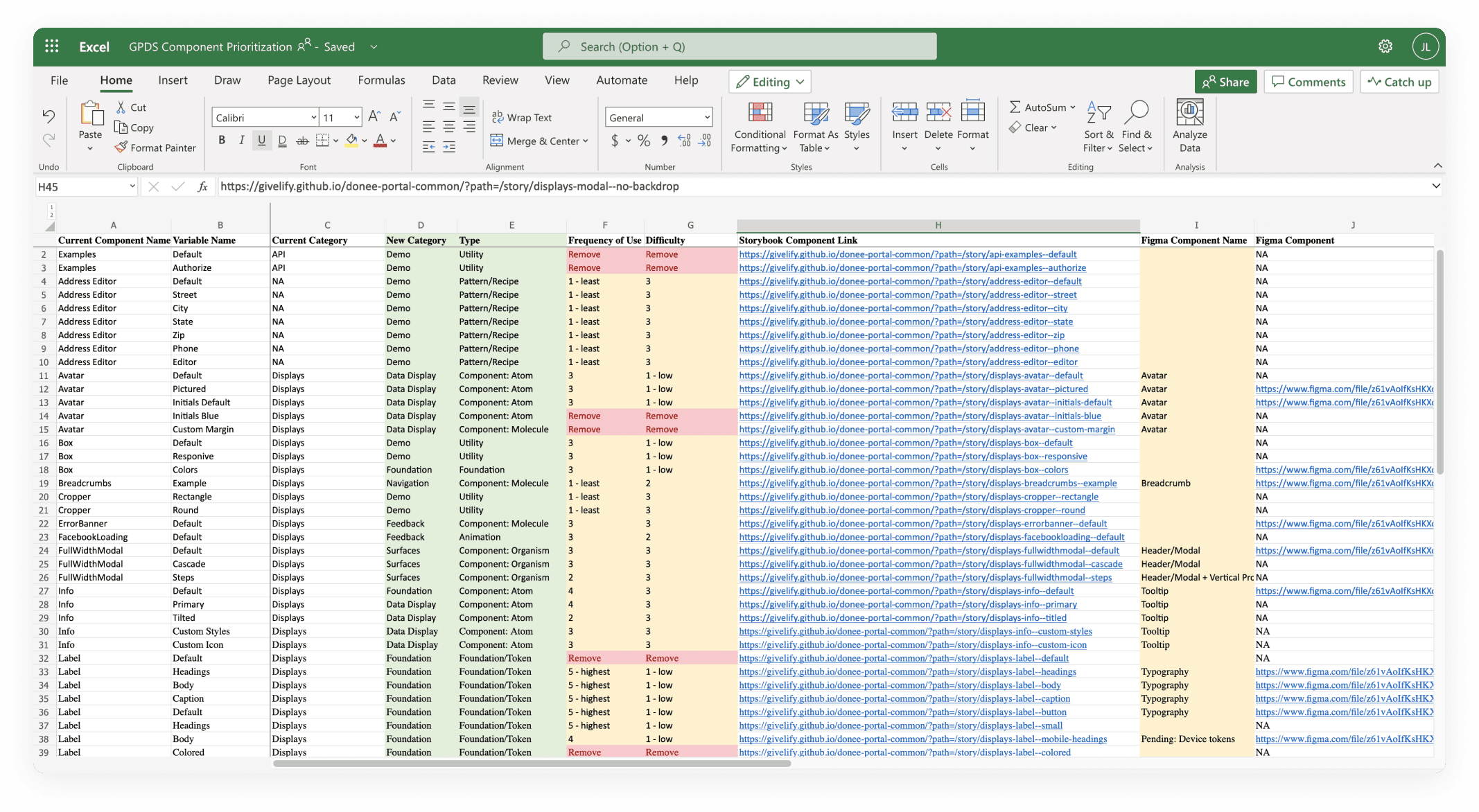
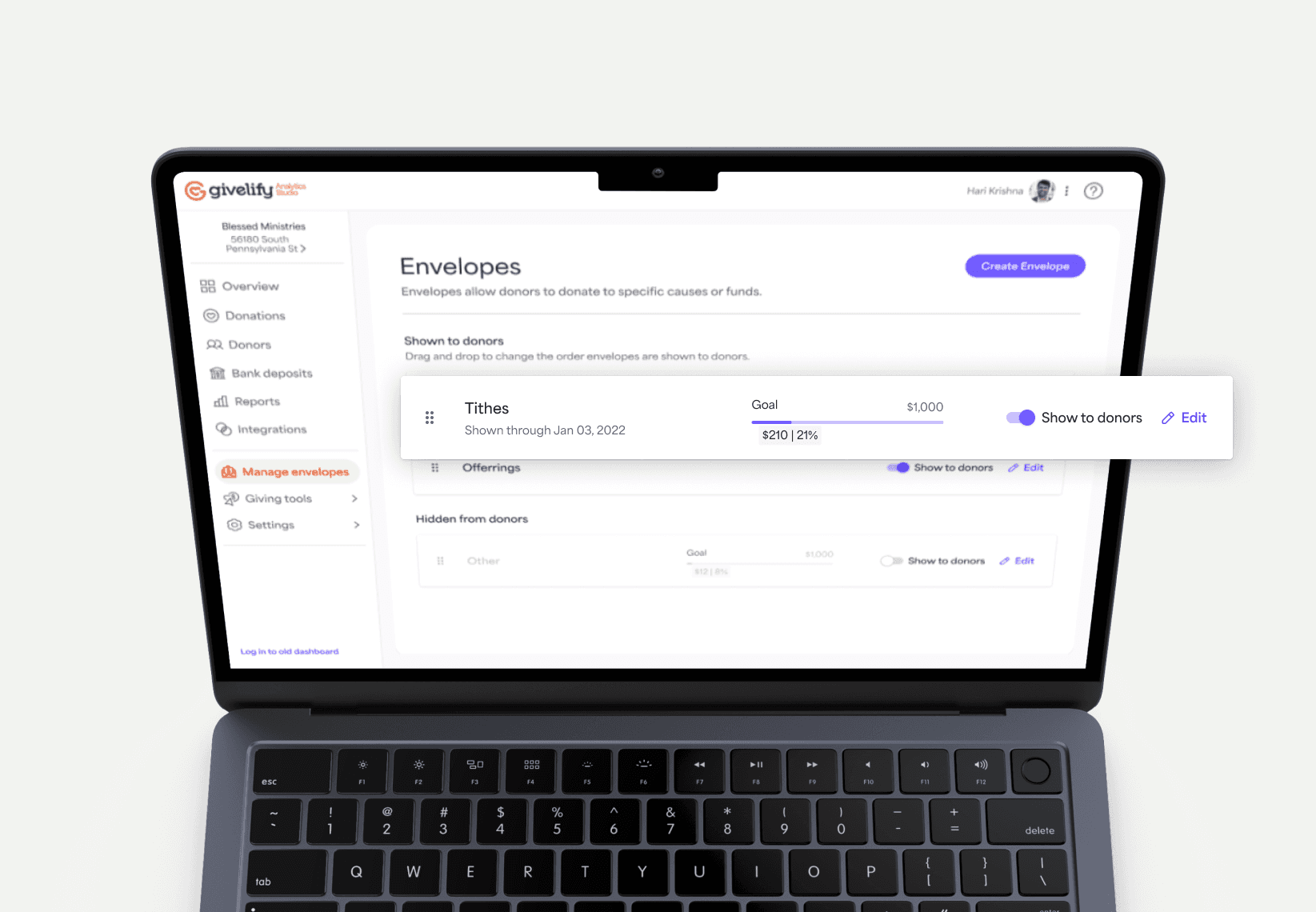
Collaboration with developers was key to implementing the design system effectively. A one-to-one mapping was created from the design system in Figma to the developer Storybook, ensuring alignment between design and implementation.
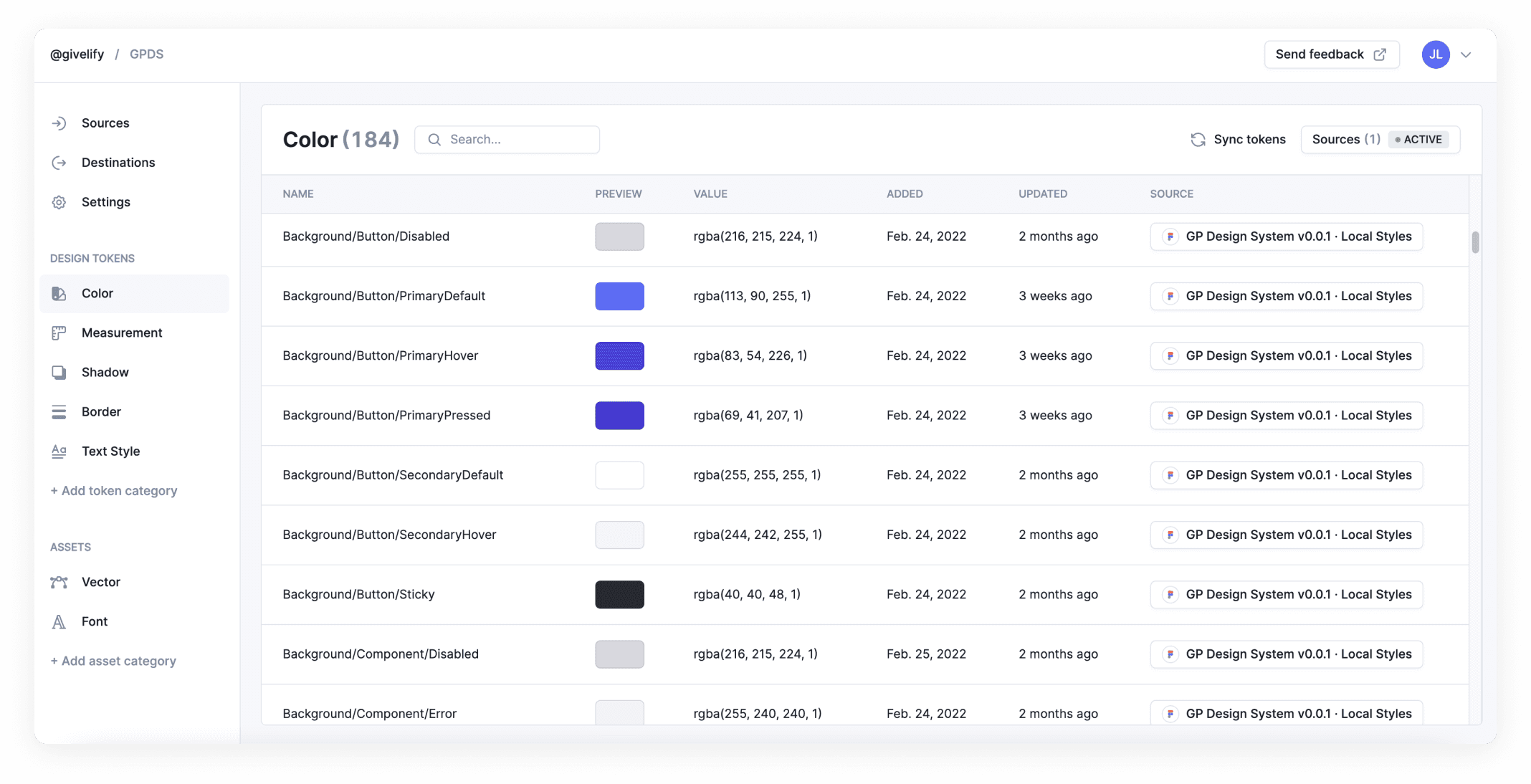
In addition, I created a roadmap to start implementing design tokens to store our visual design attributes such as color, typography, spacing, border radius, and border styles to push maximum modularity and reusability, ensuring a closer parity between design and implementation while strengthening design and developer communication. We demoed a few token tools and settled upon Specify in tandem with Theemo Figma plugin for alias and component token creation due to their technical support and ease of use and implementation from both the design and development perspective.
Ensuring user satisfaction
Usability testing is necessary for the design system to continue to be iterated upon to evolve the design system with the changing needs of the user and business. After training sessions were complete, we started testing with a small group of designers who were willing to test the design system to see if it will fit their needs.
Our user testing started with a pre-roll out beta with 4 of the senior product designers using the soon-to-be released design system as they worked in their normal workflow. Designers were asked to use the design system and document any desires, gains, and pain points as they go through their regular workflow as they use the design system library on their Figma designs and complete a survey after 2 weeks of check-in interviews.
Design System Beta Roll-out Pain Points
Initial learning curve to use system
Additional need for flexibility for changes in requirements
Breaking changes on designs with component updates
Resource constraints to maintain and update
Design System Beta Roll-out Gains
Saved time and energy
Easy to use
Iterating on issues
One of the largest problems we ran into while maintaining and updating the design system was addressing changes made to the design system prior to having a change management process. Some changes to Figma design system components caused cascading breaking changes that disrupted designer's designs, which caused some initial pain points. We sat down as a team to retrospect on this issue and discussed several options to test and iterate upon.
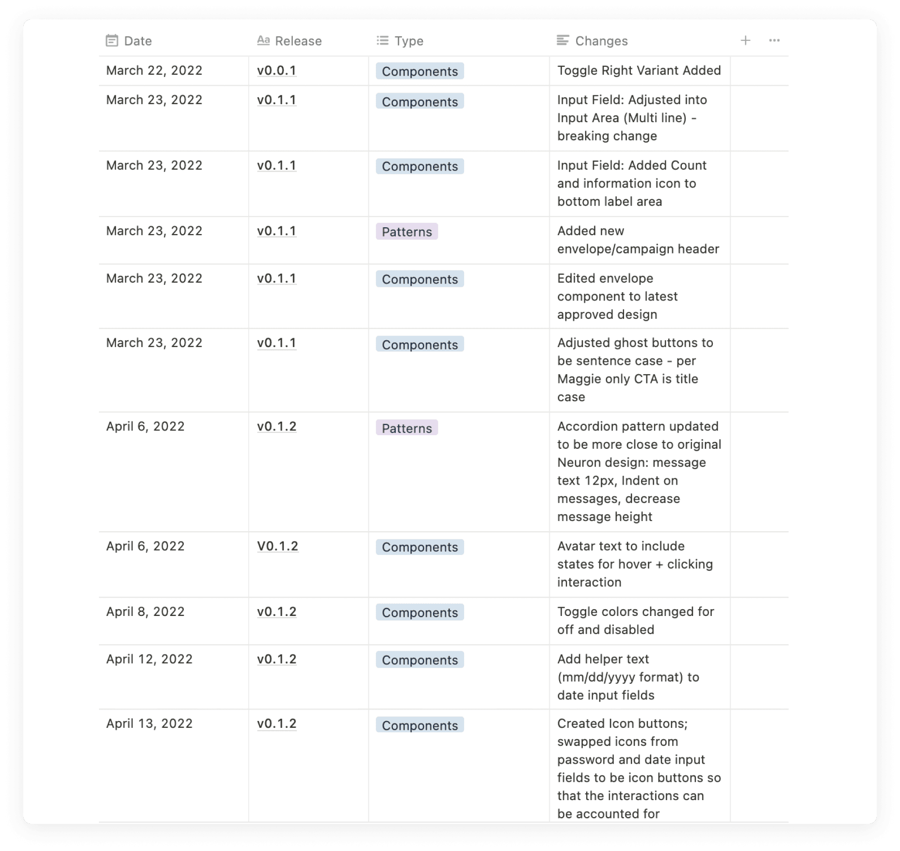
Change releases documentation and sync with slack channel
Create new variant for breaking changes
Breaking change documentation, notification, and communication
Closing thoughts
The design system project was a valuable learning experience, highlighting the importance of collaboration, empathy, and continuous improvement. While the design system is never truly finished, the foundation laid will serve as a framework for future enhancements and scalability.
Resource constraints and competing priorities posed challenges, requiring the design system to be broken down into manageable phases and treated as a separate initiative from product design. Executive buy-in was crucial for securing the necessary resources and support for the design system.
By establishing a design system, Givelify has made significant strides in improving design consistency, collaboration, and scalability. The design system initiative is a never-ending journey as the design system needs to continue to evolve to meet the advancing needs of our users in tandem with the availibility of enhanced technologies.
100%
Designer satisfaction giving 5 in happiness scale
100%
Adoption of design system by designers
100%
Improvement in designer developer collaboration